Bay and bow windows are beautiful, sought-after features in homes across the UK. They were first built into British...
Latest posts
-
 How to style roman blinds on bay windows – a comprehensive guideRead more
 -
 Small Bedroom Ideas - How to Choose the Perfect Blinds to Maximise SpaceRead more
Transforming a small bedroom into a functional and stylish space can be challenging, but with a few clever design...
-
 How to Choose the Right Colour Combination for Curtains in Your HomeRead more
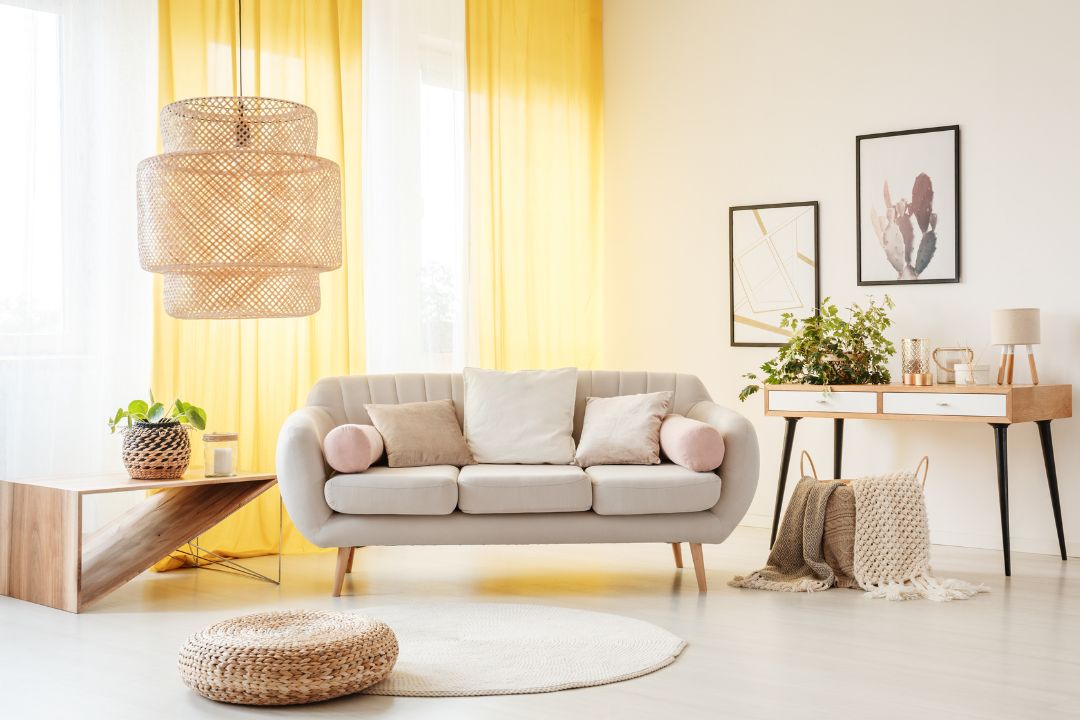
Curtains play a significant role in defining a room’s style and mood. Whether you’re looking to create a cosy living...
-
 Curtain Poles vs. Curtain Tracks - A Comprehensive Guide To Choosing The Right Window TreatmentRead more
When it comes to dressing your windows, the fixtures you choose to hang the curtains can make all the difference both...
-
 Your Ultimate Guide To Wave Curtains: Elevate Your Home's AestheticsRead more
When it comes to dressing your windows, curtains play a pivotal role in setting the tone and ambience of a room....
-
 Smart Home Blinds: Everything You Need to Know Before BuyingRead more
Automatic blinds take smart home living to the next level. With the ability to control lighting, privacy and energy...
-
 Types of Blinds - Your Detailed GuideRead more
Window blinds offer the perfect mix of practicality and style. These sleek window coverings provide control - you can...
-
 Creating a Dreamy Kids' Bedroom: How Made-to-Measure Patterned Curtains Elevate the SpaceRead more
Designing a magical bedroom for a child is an exciting project. On the wish list is a space where creativity,...
-
 Transform Your Bathroom with Trendy Roller Blinds: Design Ideas and InspirationRead more
The bathroom is often overlooked when it comes to home decor, yet it's a space that deserves attention and style....
-
 The Ultimate Guide to Choosing Pencil Pleat Curtains for Custom Window TreatmentsRead more
Pencil pleat curtains are one of the most popular window coverings in the UK. This style is versatile because it is...
Blog categories
Search in blog

How to Choose the Right Colour Combination for Curtains in Your Home
Curtains play a significant role in defining a room’s style and mood. Whether you’re looking to create a cosy living room, a vibrant dining area, or a serene bedroom, your choice of colour combination for the curtains, walls and flooring will have a major impact.
To begin using colour combinations effectively, it is essential to understand a colour spectrum wheel. Colour spectrum wheels are diagrams used by interior designers to demonstrate the relationship between the different colours. Each hue is laid out uniformly in a circle, providing a visual aid to help you see how colours look together. On the wheel, cool colours are next to each other on one side, and warm colours are grouped opposite. Warm colours include purples and reds through to yellows, while the cool shades include blues and greens through to purple.
To add colour combination curtains to your room, look at the relationship between the shades in the rest of the space. Pick hues that are close to each other on the wheel for a harmonious look, or opposite for a bolder, more striking style.
Here’s a guide to help you pick the right shade of curtains for your home.
Understand Your Room's Purpose and Mood
Start by considering the function and feel you want for the room you are transforming. Focusing on the desired final result makes it easier to choose the right curtains.
To create a welcoming space, such as the hallway, living room or dining area, consider warm tones like reds, oranges and yellows. When you’re picking colour curtains, consider the range of softer shades, because bold colours are more lively and can be overwhelming. Heather, rust, terracotta and mustard are sophisticated shades that are perfect for curtains, whether they are chosen in plain or patterned fabrics. If you want to add curtains that add a pop of drama, pick a colour on the opposite side of the colour wheel, such as dusty blue or muted green. Placing a few accessories in the same shades will bring everything together effectively.
To create a more tranquil and restful feel, opt for neutrals and colours that are reflected in nature. For example, green curtains in shades of olive, sage and mint will suit neutral palettes. Patterned curtains with leaf or plant designs would blend into the theme perfectly. These window coverings work exceptionally well with furniture and accessories made from natural materials such as wood, bamboo, glass and wicker. Avoid straying too far from colours that are next to each other on the wheel for a serene style; adding shades from the opposite side will alter the feel, so use a delicate hand when using red or black, for example.
Grey curtains or blinds are the obvious choice when you need to project a feeling of focus and organisation, such as when decorating a home office or working space. Shades of grey feature at the centre of the colour wheel, meaning the hue works well with everything. Grey with a touch of blue leans towards the cool colour side and grey with a hint of yellow is warmer. Use grey curtains as a backdrop in any room; an ideal choice if you think you will redecorate soon.
When it comes to the bedroom, aim for restful and soothing colours. Pink curtains are often used for their gentle qualities, but soft blue, green, or cream are excellent for colours that create a peaceful environment conducive to sleep. Again, it is useful to go for colour combinations on the same side of the wheel when decorating tranquil rooms.
When transforming kitchens or playrooms, these spaces can handle brighter, more energising colours. Use the more striking shades of yellow or bright orange with deep blue curtains for vitality. Spaces where you are more creative or busy are ideal for using colours on opposite sides of the wheel.
Coordinate Curtains with Existing Decor
Your choice of colour curtains should complement the existing decor, including the wallpaper, soft furnishings and floor coverings. There is more than one direction to go - you can match, mix or contrast the colours. Here’s how to achieve harmony:
Choose curtains in a similar colour to your walls for a cohesive look that makes the room feel larger.
To create a striking effect, opt for a colour that stands out against your walls and furniture. If your walls are neutral, picking bold-coloured curtains can become the focal point.
Use a colour wheel to find complementary contrasts. If your room has blue accents, orange curtains can add a vibrant impact. Subtle green fabric will create interest in a soft pink room, or consider yellow with shades of blue.
Consider the Light
The colour of your curtains can affect how much light enters your room. Depending on the way your windows face and your lifestyle, think about what you want to achieve in each space.
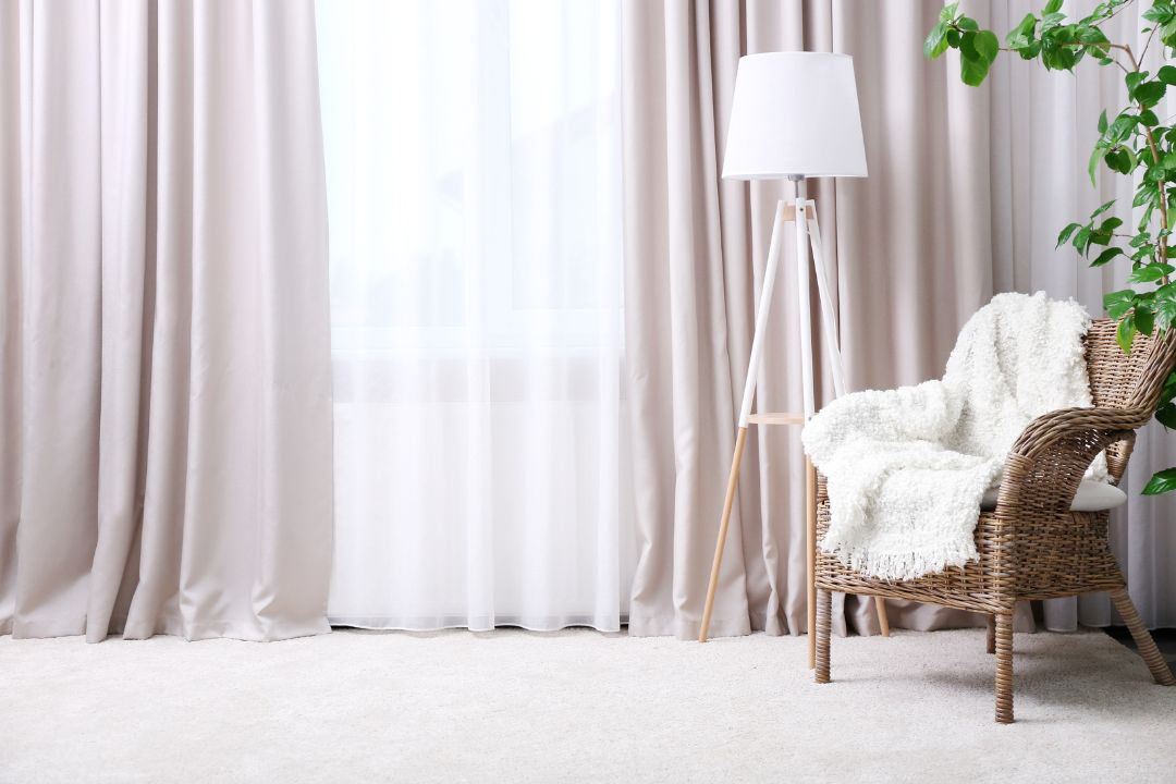
Light and airy rooms require curtains that allow more natural light to filter through, making them ideal for small rooms or spaces that need brightening up. Cream, white or beige curtains are options that filter less light and offer brighter backdrops.
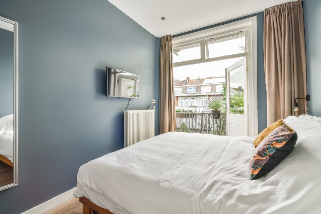
Dark and cosy rooms create a sense of intimacy and are great for large rooms or spaces where you want to block out light, such as bedrooms. Bespoke curtains in burgundy, royal blue or rich brown offer exactly the right feel.
For a balance somewhere in between, mid-green and blue curtains are the go-to choice. These shades blend with lots of different schemes and a usually fresh and welcoming. The colours filter out a great deal of light without blocking it out completely.
Final Thoughts
Choosing the right colour combination for your curtains is a critical element in creating a harmonious and beautiful home. Take your time to consider the purpose, existing decor, light, and your personal style. With these tips in mind, you’ll be well on your way to finding the perfect curtains to enhance your living spaces. Ready to find your perfect bespoke curtains? Explore our wide range of options.
Posted in:
TIPS
Related posts
-

Do Blackout Curtains/Blinds Improve Sleep Quality and How?
Have you ever wondered why you naturally feel like sleeping when night falls, or how easy it is to sleep in a dark...Read more -

Best Blinds for Your Kitchen
Picture yourself waking up in the morning to get breakfast, you stroll over to your kitchen blinds, and with a flick...Read more -
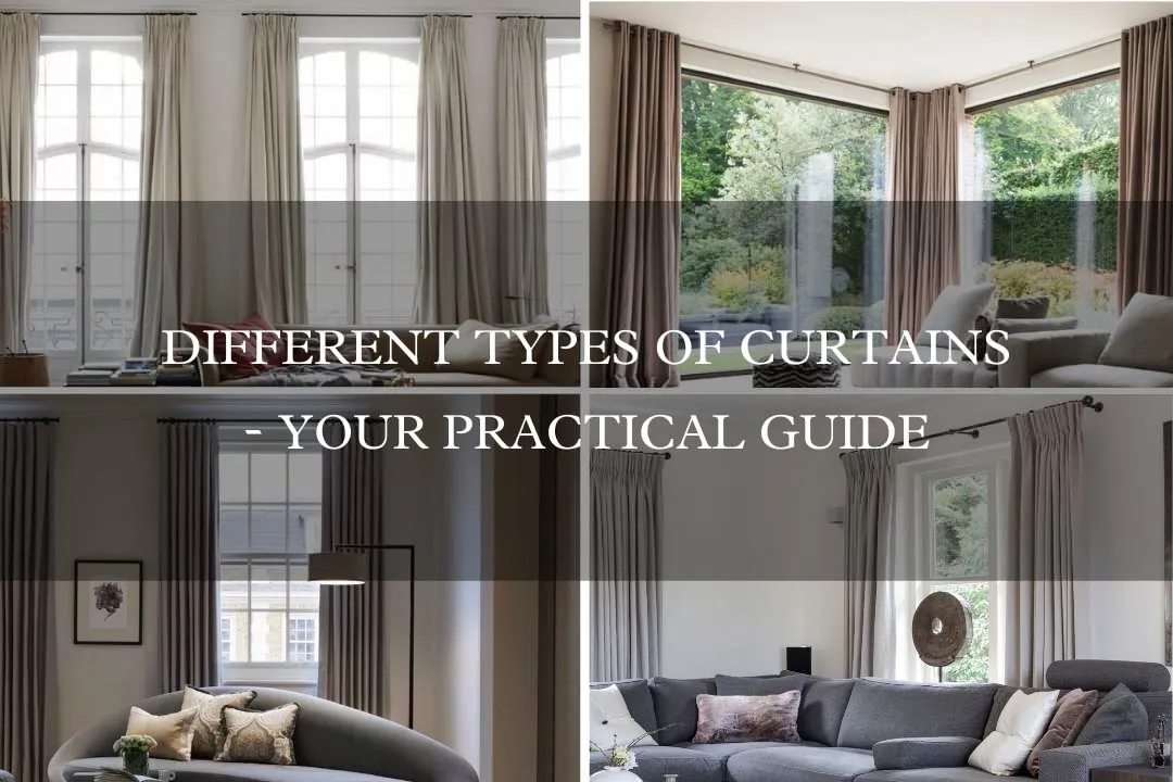
Different types of curtains - your practical guide
Curtains are the unsung heroes of our homes, providing privacy, light control, and a unique opportunity to showcase...Read more -

How to create a relaxing space
In today's fast-paced world, you need a home to relax and unwind after a long day. A space where you can recharge and...Read more -

What are Day and Night Roller Blinds Plus Benefits of Using Them?
Say goodbye to traditional blinds, and say hello to Shade in Style's day and night roller blinds' versatility,...Read more
Leave a comment